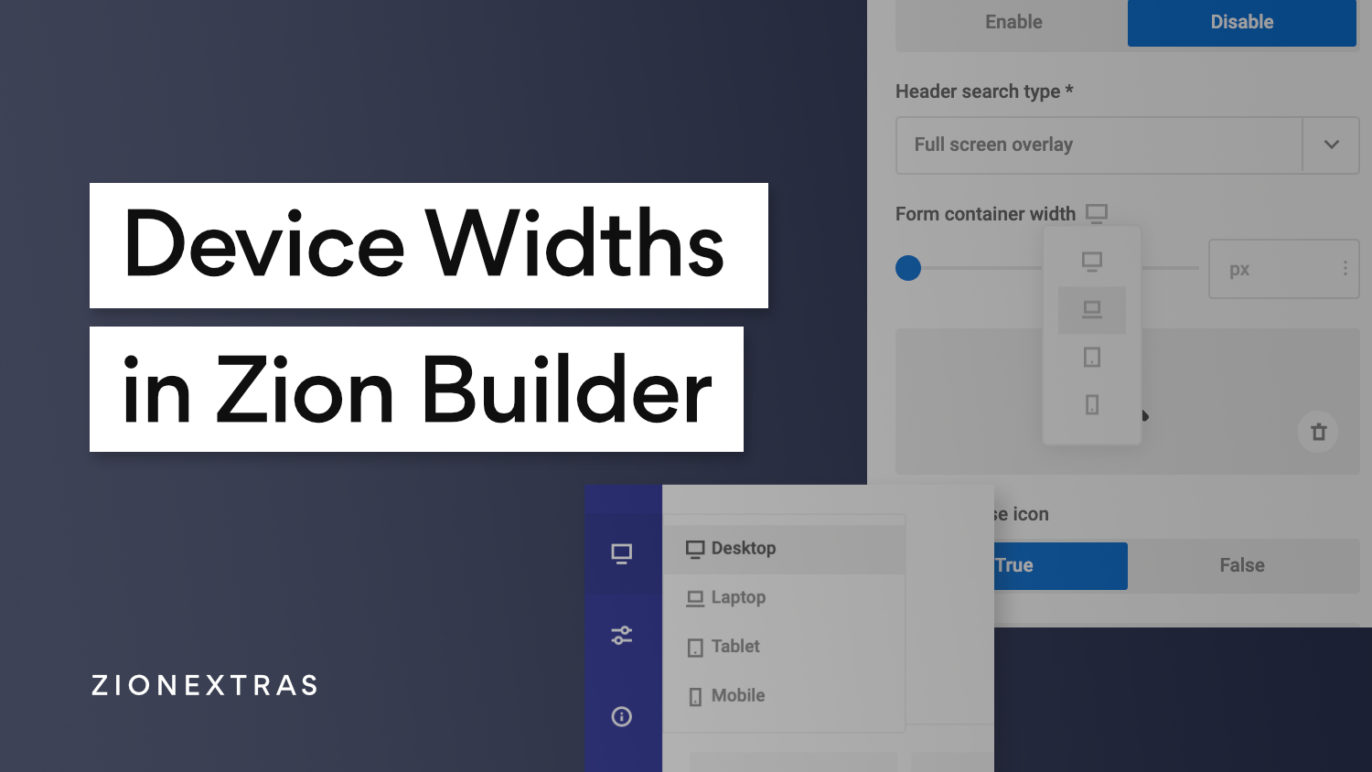
When changing styles for different device sizes inside Zion Builder, these are the exact viewport widths that where the CSS rules will be being applied.
Note that the stylesheets are output using max-width media queries. This means all styles that are applied top-down. ie on the largest screen size will be inherited down to the smallest. It doesn’t go up the other way.
The common workflow would be to add styles at desktop with all sizes in mind and then adjust as needed for the smaller devices where the layout no longer makes sense.
Current break points
There are currently four breakpoints.
Desktop – Styles added here will be added to all sizes
Laptop – Styles added here will be added to all devices with max-width of 991.98px
Tablet – Styles added here will be added to all devices with max-width of 767.98px
Mobile– Styles added here will be added to all devices with max-width of 575.98px.
(Here’s a link to the feature request if you would want more breakpoints added)
Applying Styles at Each BreakPoint
Zion Builder offers two main ways to change which device width you’re adding styles to. The first is the global setting which is always visible inside the blue editor header.
Second is the dropdown that is added to any setting that can be changed at different breakpoints. This will mostly be a setting that controls the styling of something, generally not the functionality.
Note that these two do exactly the same thing. Once in mobile view, any styling added will only be applied for that device width and lower.
